Table of Contents
Quick answer: best colours for a small Toronto condo
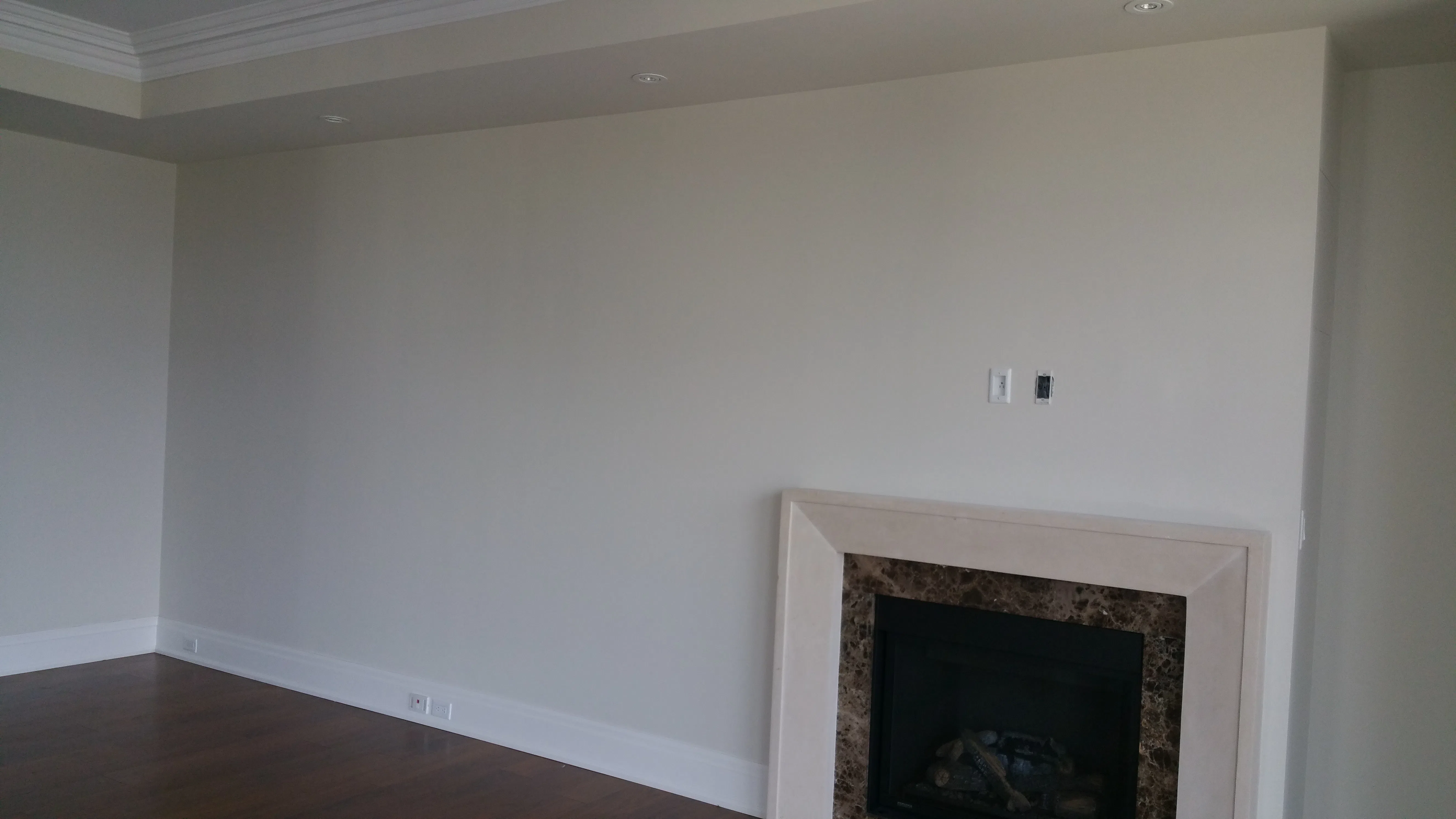
The best paint colours for small condos are light, low-contrast whites and greiges with a high light reflectance value. Across our Toronto condo projects, soft whites like Benjamin Moore White Dove and pale greiges like Pale Oak consistently make compact units feel bigger, brighter and calmer. Match the colour to your unit's light direction.
Key Takeaways
- Light, low-contrast colours with a high LRV reflect more light and make a small condo feel bigger.
- Keep walls, trim and ceiling close in tone to remove the visual breaks that shrink a room.
- North-facing units (cool light) need warmer whites; south-facing units handle cooler, crisper tones.
- Carry one colour across an open-concept space so it reads as one large room, not three small ones.
- Always test real swatches in your own unit at different times of day before committing.
Choosing colour for a small condo is different from choosing for a house. You have less square footage, fewer windows and one fixed light direction to work with. Get it right and a 550-square-foot unit feels open and airy. Get it wrong and the same space feels like a box. This guide shares the Benjamin Moore colours we trust most, grounded in our own Toronto condo work. For the full picture, start with our complete condo painting guide.
What makes a small space feel bigger?
Light, low-contrast palettes make small condos feel bigger because they reflect available light and reduce the visual breaks the eye reads as boundaries. In our experience painting hundreds of Toronto units, the units that feel most open share three traits: high light reflectance, minimal contrast between surfaces, and one colour flowing across open areas. The colour name matters less than these principles.
Light and light reflectance value (LRV)
LRV is a measurable number, not a vibe. Light Reflectance Value runs from 0 (pure black, absorbs all light) to 100 (pure white, reflects all light), and it's printed on the back of every Benjamin Moore paint chip. In a small room with limited windows, a higher LRV reflects more of your available daylight back into the space.
The practical LRV brackets for small Toronto condos:
| LRV range | Reads as | Use in small condos |
|---|---|---|
| 80-95 | White / near-white | Default for compact units; bright, opens up space |
| 65-80 | Light neutral | Soft greiges and warm off-whites; calm without losing brightness |
| 50-65 | Mid-tone | Statement colour territory; works on one feature wall, risky on all four |
| 30-50 | Darker neutral | Mood/depth approach; needs strong light and intentional design |
| Below 30 | Dark | Cocoon effect; only when committed to "all four walls dark" |
The 70+ LRV range is the safe choice for small Toronto condos: it reflects enough light to brighten a room without washing out the colour. The popular Benjamin Moore options in that range:
| Colour | BM code | LRV | Best for |
|---|---|---|---|
| White Dove | OC-17 | 85.38 | Default warm white for most units |
| Chantilly Lace | OC-65 | 92.20 | Bright south/west units, modern look |
| Simply White | OC-117 | 91.70 | North units needing warmth |
| Classic Gray | OC-23 | 74.45 | When pure white is too stark |
| Pale Oak | OC-20 | 69.79 | Subtle greige, holds up in north light |
| Gray Owl | OC-52 | 65.77 | Cooler greige; modern open-concept |
The "small room = light colour" myth is not universally true
The conventional wisdom is that small rooms should always be painted light. There's a legitimate counter-argument designers make: a small room painted dark across all four walls and the ceiling can blur its own boundaries, making the room feel less confined rather than more. The technique only works under specific conditions: (1) the colour must wrap all four walls and the ceiling, not be applied as a feature wall, (2) the room must have generous artificial lighting because daylight alone won't be enough, and (3) the room's use must benefit from the cocooning effect, bedrooms and powder rooms work, kitchens and bathrooms generally don't.
For most Toronto condo owners, the safer answer is still the high-LRV palette below. The dark-small-room approach is a deliberate design statement, not a "make the room feel bigger" trick.
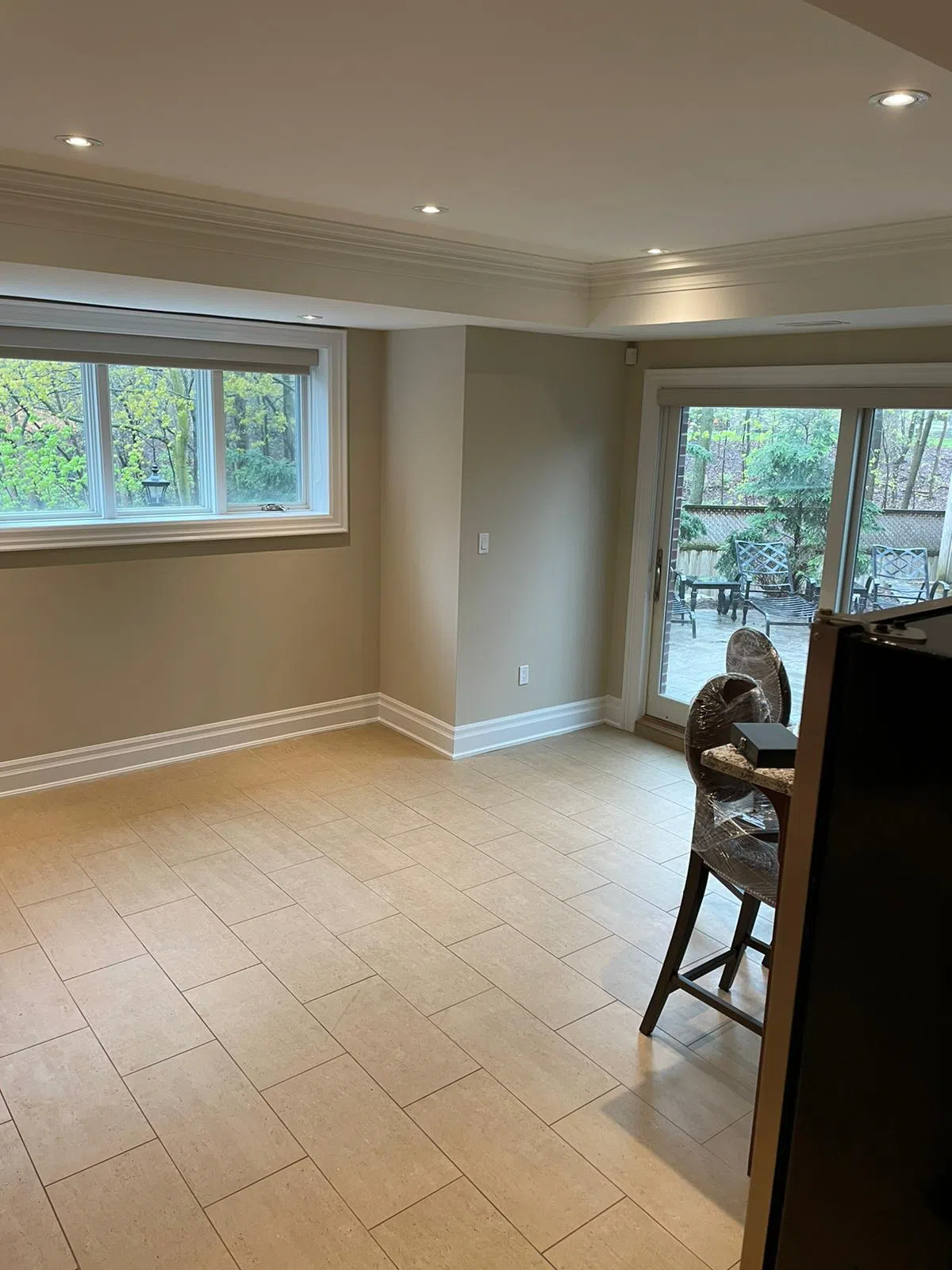
Low contrast and flow
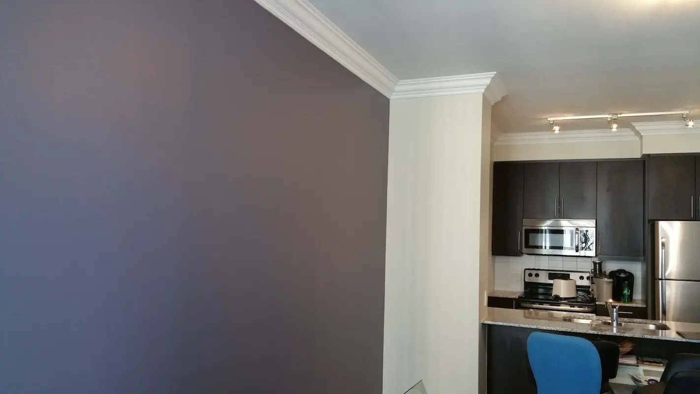
Low contrast is the second lever, and it is the one most people miss. Every hard line, between a coloured wall and bright white trim, for example, reads to the eye as an edge, and edges chop a room into smaller pieces. Keep walls and trim close in tone and those breaks soften. Then carry one colour across your open-concept living, dining and kitchen so the whole zone reads as a single larger room. Flow is what sells the feeling of space.
The 10 best paint colours for small condos in 2026
For 2026, these are the ten Benjamin Moore paint colours we recommend most for small Toronto condos. All are light, all are versatile, and each suits a particular light direction. We use Benjamin Moore exclusively, so these are colours we apply and live with week after week.
1. Chantilly Lace (OC-65)
A crisp, clean white with almost no undertone. Chantilly Lace is our pick for bright south- and west-facing condos that can carry a cooler white without it going flat. It keeps a small space feeling fresh and gallery-clean. In a dim north unit, it can read slightly cold, so test it first.
2. White Dove (OC-17)
A soft, warm white and our most-used colour in small Toronto condos. White Dove forgives almost any light, but it truly shines in north-facing units where its gentle warmth balances cool daylight. It is light enough to open up a room and warm enough to feel like home rather than a showroom.
3. Cloud White (OC-130)
Another warm white, slightly creamier than White Dove. Cloud White works beautifully on trim and ceilings, and as a wall colour in units that get cool or limited light. It pairs naturally with warm wood floors common in older Toronto condos.
4. Classic Gray (OC-23)
A very light, warm grey that still reflects plenty of light. Classic Gray is the answer when pure white feels too stark but you do not want to lose brightness. It adds a whisper of colour and depth, and it flatters both warm and cool light, making it a safe open-concept choice.
5. Pale Oak (OC-20)
A light greige that sits between beige and grey. Pale Oak is one of our favourites for small condos that want subtle warmth without committing to a colour. It reads soft and neutral, holds up well in north light, and pairs cleanly with white trim or a tone-on-tone trim approach.
6. Gray Owl (OC-52)
A cool, light grey with a modern, airy feel. Gray Owl is best in south- and east-facing units with good light, where its coolness reads crisp rather than flat. In our work it suits contemporary condos with white kitchens and clean lines. Avoid it in dark north units.
7. Balboa Mist (OC-27)
A warm greige that feels calm and enveloping while staying light. Balboa Mist is excellent in bedrooms and north-facing living rooms, where it adds cosiness without darkening the space. It is a touch warmer than Pale Oak and reads slightly more grey in cool light.
8. Edgecomb Gray (HC-173)
A light beige-grey that bridges warm and cool. Edgecomb Gray is a dependable whole-unit colour for small condos with mixed light or rooms facing different directions. It rarely surprises you, which is exactly what you want when one colour flows through an open space.
9. Healing Aloe (1562)
A soft green-grey, barely there, for clients who want a hint of colour without losing the light, open feel. Healing Aloe is lovely in a small bathroom or bedroom, especially with natural light. It reads almost neutral but adds a fresh, spa-like calm that pure white cannot.
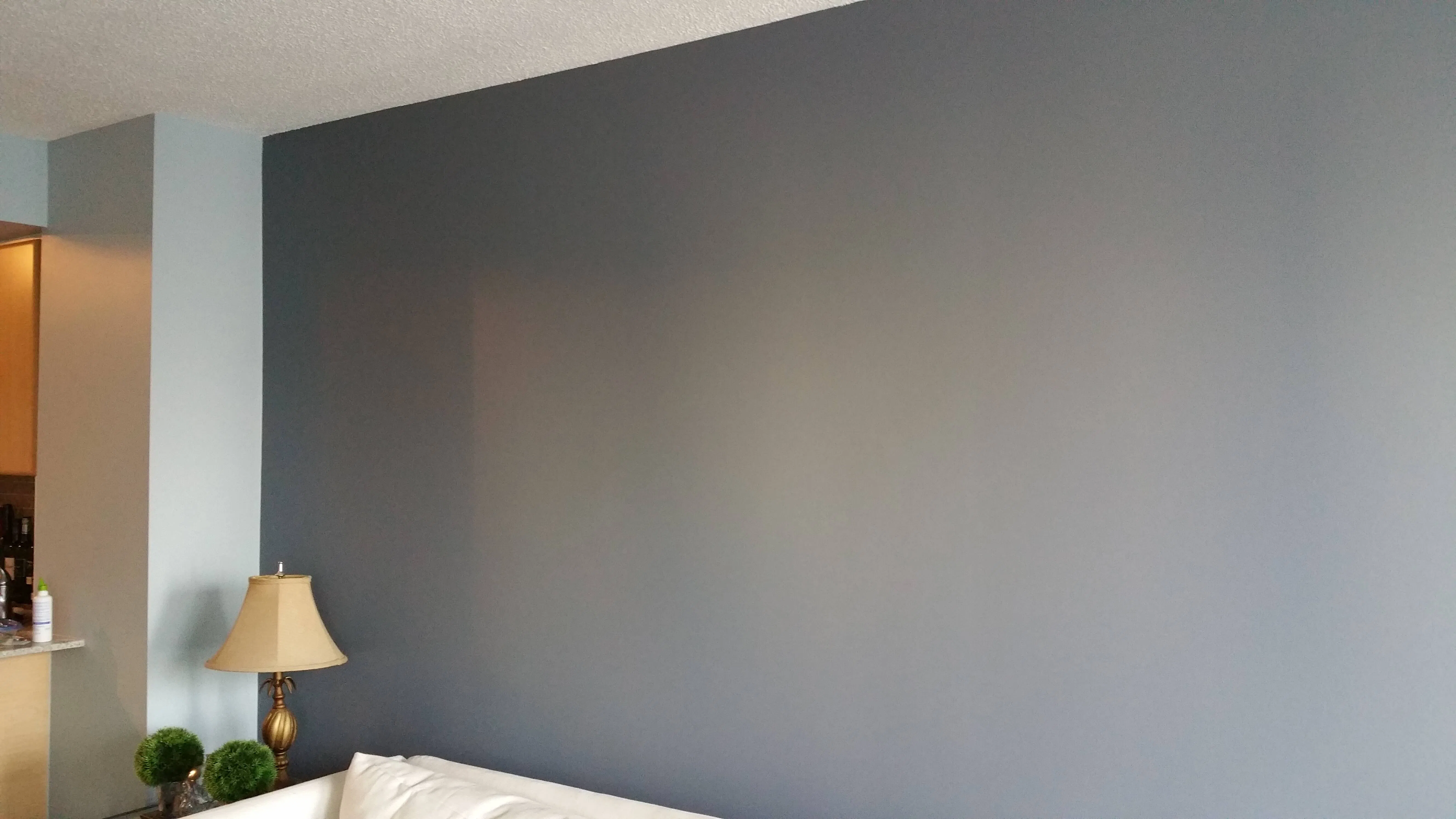
10. Hale Navy (HC-154)
The one deep colour on the list, and the only one we use sparingly. Hale Navy is not for every wall in a small condo. It is for a single accent wall, behind a bed or a sofa, where one controlled dark moment adds depth without shrinking the unit. Pair it with light walls everywhere else.
How do I choose by light direction?
Light direction is the single biggest factor in how a colour reads, and choosing for it is the difference between a colour that sings and one that disappoints. North-facing Toronto condos get cool, blue-leaning light, so they need warmer whites and greiges to compensate. South-facing units get warm, abundant light and can carry cooler, crisper tones that would look flat elsewhere.
If your unit faces north, lean on White Dove, Cloud White, Pale Oak or Balboa Mist. These warm up the cool light and stop a small space from feeling cold or grey. If your unit faces south or west, you have more freedom: Chantilly Lace, Gray Owl and Classic Gray all stay clean and fresh in generous light. East-facing units get bright morning light and softer afternoons, so a balanced neutral like Edgecomb Gray works well.
Pro tips for choosing colours in a small unit
After years of small-condo work across the GTA, a few habits separate a colour that lands from one we get called back to fix. Run through this short list before you open the first can:
- Test large swatches morning and evening in the actual unit. Toronto light swings hard between sunrise and dusk, and a white that looks soft at 8 a.m. can go grey by 7 p.m. A tiny chip will not show you this; a two-foot patch will.
- Keep trim and walls close in tone. High contrast between bright trim and a coloured wall creates hard lines the eye reads as edges, which chop a tight room into boxes. Near-matching tones soften those breaks.
- Carry one colour through the open-concept space. Run a single colour across living, dining and kitchen so the zone reads as one room, not three small ones. Change colour only at a door or clear break. For cabinet-specific palette picks that keep a tight kitchen feeling open, see the best cabinet colours for small condo kitchens.
- Mind the LRV. In a unit with few windows, a higher light reflectance value bounces more daylight back into the room. We lean on whites and greiges in the 60-plus range and reserve darker tones for one accent wall at most.
- Account for light bouncing off neighbouring glass towers. Downtown, your real light source is often the building across the street. A wall of mirrored windows can throw cool, indirect light into a unit that technically faces south, so read the room, not just the compass.
We once chose a crisp white for a north-facing CityPlace one-bedroom, confident it would stay clean. It looked cold and slightly grey on the wall, because the unit overlooked another tower and got only cool, second-hand light all day. We switched to White Dove and the warmth pulled the room back. A Humber Bay Shores unit we painted the same month was the opposite: flooded with bright lake light, it took a cooler grey beautifully.
Neighbourhood matters here. The tiny one-bedrooms and studios common in CityPlace, Liberty Village and Fort York reward a light, low-contrast palette that squeezes the most out of limited windows. Units facing other towers get weaker, indirect light and need warmer whites to stay inviting, while lake-facing units in Humber Bay Shores and along Harbourfront carry crisper greys without going flat. Heritage lofts in King West and the Distillery District, with their big industrial windows, can handle more depth and even a deeper feature wall.
Should I test swatches first?
Yes, always, and it is the cheapest insurance in painting. A colour that looks perfect online or on a tiny chip can read grey, yellow or cold once it is on your actual wall. Your condo's floor, orientation and windows make its light unique, so the only reliable test is in the room itself.
Paint a generous patch, at least a couple of square feet, on more than one wall, since light hits each wall differently. Look at it morning, midday and evening, and with your lights both on and off. We bring sample boards to every colour consultation for exactly this reason. Ten dollars of sample paint prevents the most expensive small-condo mistake: repainting the whole unit a week after move-in.
Pairing trim and ceiling
For trim, stay close in tone to your walls to keep contrast low and the space open. A popular approach in small condos is the same colour on walls and trim with different sheens, satin or semi-gloss on trim, eggshell or matte on walls. For ceilings, keep them light, a soft white like Cloud White, to add height. If you want one bolder feature, see our guide to adding an accent wall before you commit a whole room to deep colour. And if you are still deciding between whites, our breakdown on choosing the right white goes deeper on undertones.
Get a free condo colour consultation
Choosing colour for a small condo is part science, part judgement about your specific light. We help Toronto and GTA condo owners get it right the first time, with Benjamin Moore colours, sample boards in your actual unit, and a 5-year workmanship warranty on the finished work. If you would like a hand, request your free quote and we will walk your space, test swatches in your light, and recommend colours that make your unit feel as open as it can. For more background first, revisit our complete condo painting guide.
Chad Saygili is Co-Owner of Condo Painters Pro, a Toronto and GTA condo painting specialist.
Chad Saygili is co-owner of Condo Painters Pro, a Toronto condo painting specialist. He has spent years painting condos across Toronto and the GTA, works exclusively with Benjamin Moore, and backs every job with a 5-year workmanship warranty.
MORE ABOUT OUR TEAM →